If you’re ready to publish your behavioral data, then you are probably thinking about different ways to visually describe the results. Standard bar graphs and line graphs are great for describing statistical differences, but have you considered showing data from representative individuals? Showing off a big effect with images can be visually striking and help to get your point across. In this post, we’ll talk about what types of visual data BehaviorCloud generates automatically and walk through how to use the raw XY data generated by BehaviorCloud to create a contour plot using R.
Tracing a path:
BehaviorCloud uses computer vision to track animal behavior in a maze or homecage and then automatically generates a trace showing the path that the animal traveled during the trial. This trace can be found in the Raw Position Data page of your Experiment dashboard by clicking an individual subject. This type of visualization is useful for depicting representative differences between experimental groups. When the path is overlaid onto an image of the test environment it’s especially easy to understand how these two mice differ.


Tracked video data:
BehaviorCloud also automatically generates video showing the subject being tracked throughout the trial. These videos are available from the Raw Position Data page of the Experiment dashboard and can be downloaded as .mp4 files and embedded into presentations or submitted with a manuscript as supplementary data.
![]()
Getting fancy - Contour plots in R
If you’re interested in making custom plots of your data, BehaviorCloud makes it easy to download the raw XY position data from each subject. Access the .csv files from the Raw Position Data page of your Experiment dashboard by clicking on an individual subject and then clicking Download. You can use those files to create your own customized plots. Here we’ll walk through how to make a custom contour plot using R.
- If you don’t have R installed on your computer, you can download it from cran.R-project.org. We recommend installing RStudio as well, from www.RStudio.com.
- In RStudio, type
getwd()to check the working directory. Your .csv files should be saved in this directory. To change the working directory to another location, use the commandsetwd(“path”), where path is the path to the desired directory on your computer. - Download the raw XY position data from BehaviorCloud for the trials you’d like to plot. Save them to your computer in the working directory. We saved our file as “of.csv”.
- Use the command
install.packages(MASS)to install the MASS package, courtesy of Venables, W. N. & Ripley, B. D. (2002) Modern Applied Statistics with S. Fourth Edition. Springer, New York. ISBN 0-387-95457-0 - Type
library(MASS)to load the MASS package. - Read in one of your .csv files from BehaviorCloud using the function
of <- read.csv("of.csv") - Calculate density using the function
dens <- kde2d(of$X.Coordinate, of$Y.Coordinate, n=100) - Plot the contour plot by typing
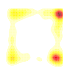
filled.contour(dens, color.palette = colorRampPalette(c('white', 'yellow', 'orange', 'red', 'darkred')), axes = FALSE, asp = 1)
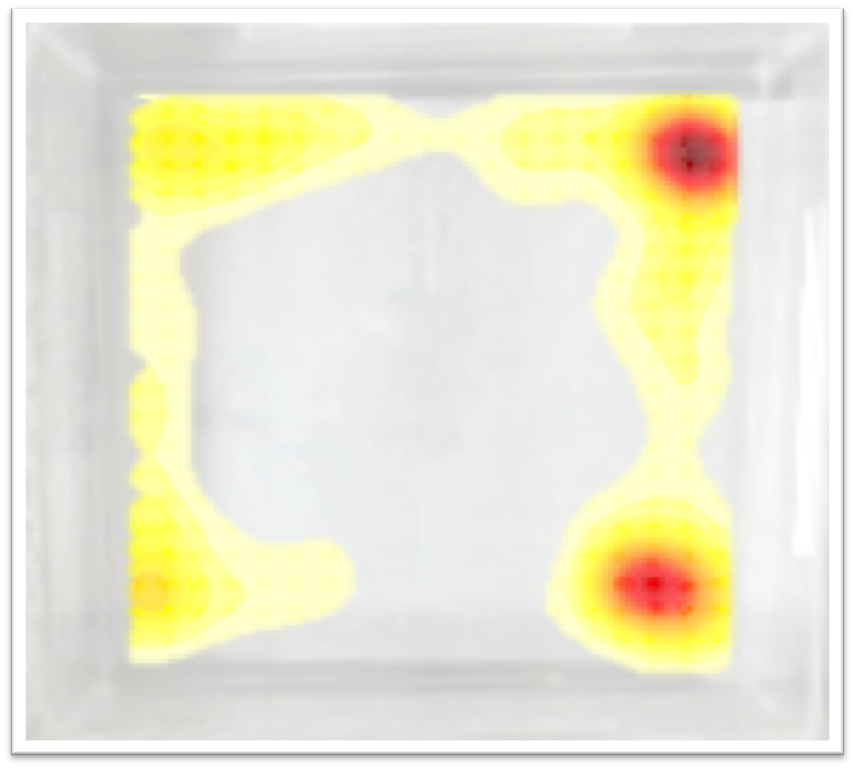
That’s it! Now you have 3 different visually appealing plots to represent individual subject data in your next publication or presentation. Thanks for reading and stay tuned for more posts like this one!